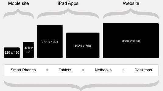
One of the most used techniques for building websites that are able to work on mobile devices, tablets and desktop screens is responsive web design. In the near past, almost all of the websites were designed in a specific way for laptop and desktop screen resolutions.
This was very good option before invention of smartphones and tablets that is capable for accessing internet. Many web designers worked hard in finding solution for making web sites which can work on any devices like desktop computers, laptops, mobile phones, tablets and many more. Winner in finding of this solution was Ethan Marcotte’s who wrote article for a Responsive web design back in May of 2010.
Many changes were made on responsive website design since then, and it has evolved to an extent in last two years. However if you are new to the world of web design then in this article you will find answer of the question “What is the responsive web design” and it will help you to catch up with the present.
What is Responsive Web Design?
For sure you have asked your self at least once “What is responsive web design?” You will find this answer here. This type of web design is an approach where the designer is creating web page, that is suitable to or resize itself depending on the type of the device which is running and depending on the size of the screen.
There can be many devices like oversized desktop computer monitor, a laptop, a 12 inch tablet, a 8 inch tablet or a 4.2 inch smart phone screen and many more devices.

Exactly 2013 year was called the Year of the responsive website design. Pete Cash more wrote, “For those of us who create websites and services, all this leads to a singular conclusion: A million screens have bloomed, and we need to build for all of them.”
How does responsive web design work?
Fluid grids are used by sites developed with responsive technique. All of the elements of page are sized by proportion, rather than pixels.
For example if you need three columns, you don’t need to tell exactly how wide each should be but you will need to tell how wide they need to be in a relation to the other columns. Exactly Column 1 should take up half the page, column 2 should take up 30%, and column 3 should up 20% for instance.
Medias like images are also resided relatively. In that way an image can stay within its column or relative design element.
Conclusion:
Here, we have described web design very briefly. If you wish to get an elegant web design developed then you can get in touch with well known firm of Responsive website designing services – Platinum SEO based in Melbourne.