Web Design consists of several elements. Some of them are useful while some of them may badly affect the conversion rates. Here, in this blog post; today we will focus on those elements that are solely responsible for reduction in conversions.
Let’s take a look at these elements and make sure every time you check them before applying:
- Rotating Image Carousels: Generally, it is believed that rotational slides or carousels can make a website active. They also cover the maximum space by displaying several messages.
Well, perfectly a study reveals that usage of such image carousels makes it difficult for users to answer even simple questions. It becomes impossible for viewers to view and understand the message.
Hardly 1% of visitors seem to get engaged with the website having image carousels. Among these, very few go through all sliders; most of them just visit only one.
So why are these ineffective?
There are various reasons for the same. Sliders generally move faster hence instead of viewing the message, focus gets diverted on movement. Most of the sliders keep on delivering messages that people are sometimes unable to absorb.
Speed is also a huge factor here as it plays an important role. Most of the websites have faster rotation speed and these are too fast that before actually completing one slide, another appears. This can sometimes frustrate visitors.
Does this mean you must avoid using banners? No, however before implementing them, carry out a split test to ensure that it doesn’t harm your conversion rates. You can also use sliders that are to be changed manually instead of the automatic ones.
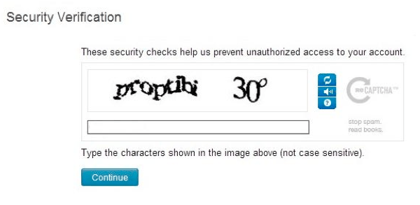
- Captchas: These are very useful as they ensure that the message is from a human being and not a robot as certain bots are responsible for malicious codes. Links can be added to boost search engine rankings as well as mass advertisements.
Captcha stands for Completely Automated Public Turing tests to tell Computers and Humans Apart.
These can actually be very difficult to read however the decision is entirely based on website owners.

Also, filling too many details in a form can also be a boring task for visitors. A form must contain at the most 3 fields. Forms without captcha led to 33% increase in conversions. Instead of Captcha, one can make use of honey pot method where there’s one field in the form which must remain blank and this is hidden. This is a proof that the form is filled by a robot and not any human being.
- Stock Photography: So, whenever you open that website; you can get a message” Hi Guest! Welcome Back”. How may I help you? With an image of a pretty looking live-chat operator.
So, how much viable this option is? Yes, professional images are necessary however one must refrain from using images of people whom you even don’t know.
Always add the images of people who really work for you.
- Hamburger Menus: It is completely a new trend and is basically used on mobile sites, when clicked on it; it opens up a menu-bar. The navigation menu bar is the hub of websites that allow visitors. This is very important factor. Hence, one must ensure that visitors actually click on that hamburger menu.
However, how visitors will actually know what this icon represents? It is a good chance of them that it won’t. If we talk of its effect on conversion rates then menu is clicked 20% more than that of a button.
Take Away:
Spreading your message across the page; keeping the bots away from spreading viruses and developing professional sites are important factors. Hence, make sure to know how elements will actually affect the conversion rates.
Reduce the speed of image sliders, use images of real people, adopt honey pot method instead of captcha and clearly display the MENU instead of using graphical languages like Hamburger menu button.
Well, that’s it for now. This will be definitely useful to you. Feel free to provide your suggestions. Get in touch with us at Platinum SEO; an esteemed web design services provider in Melbourne.